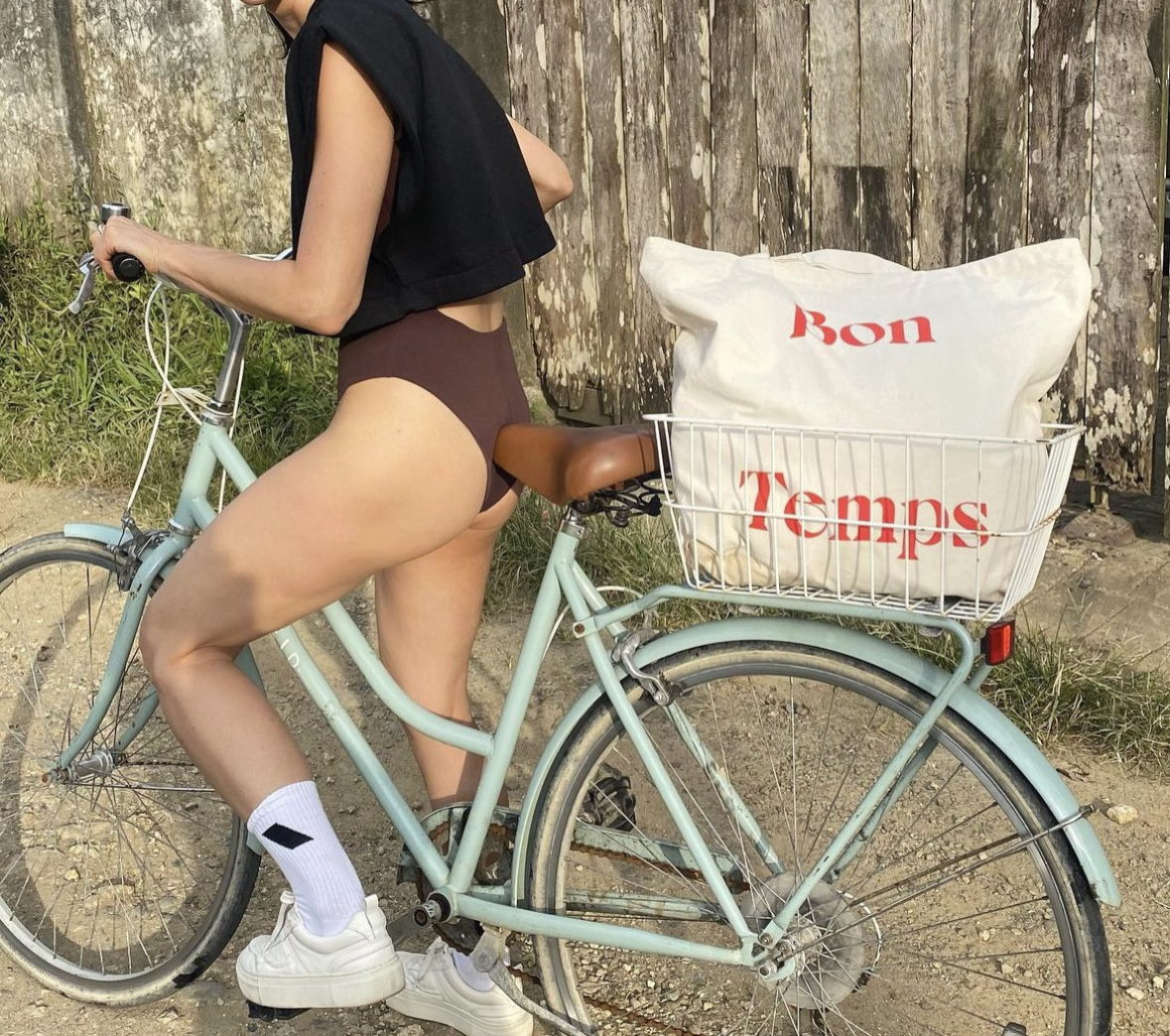
Bon Temps
PROJECT
⇝ Branding
CLIENT
⇝ Bon Temps
ROLE
⇝ Art Direction + Design
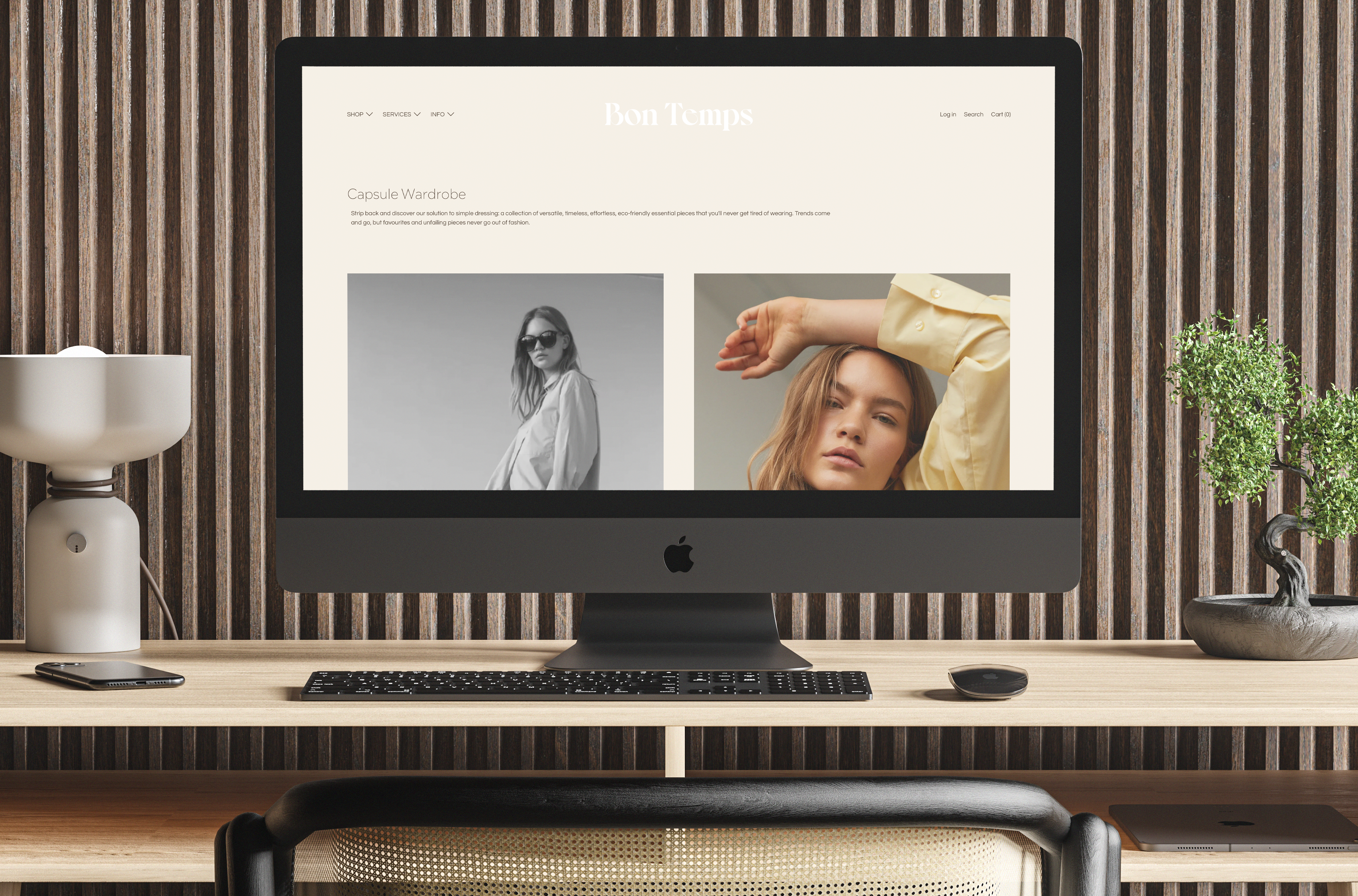
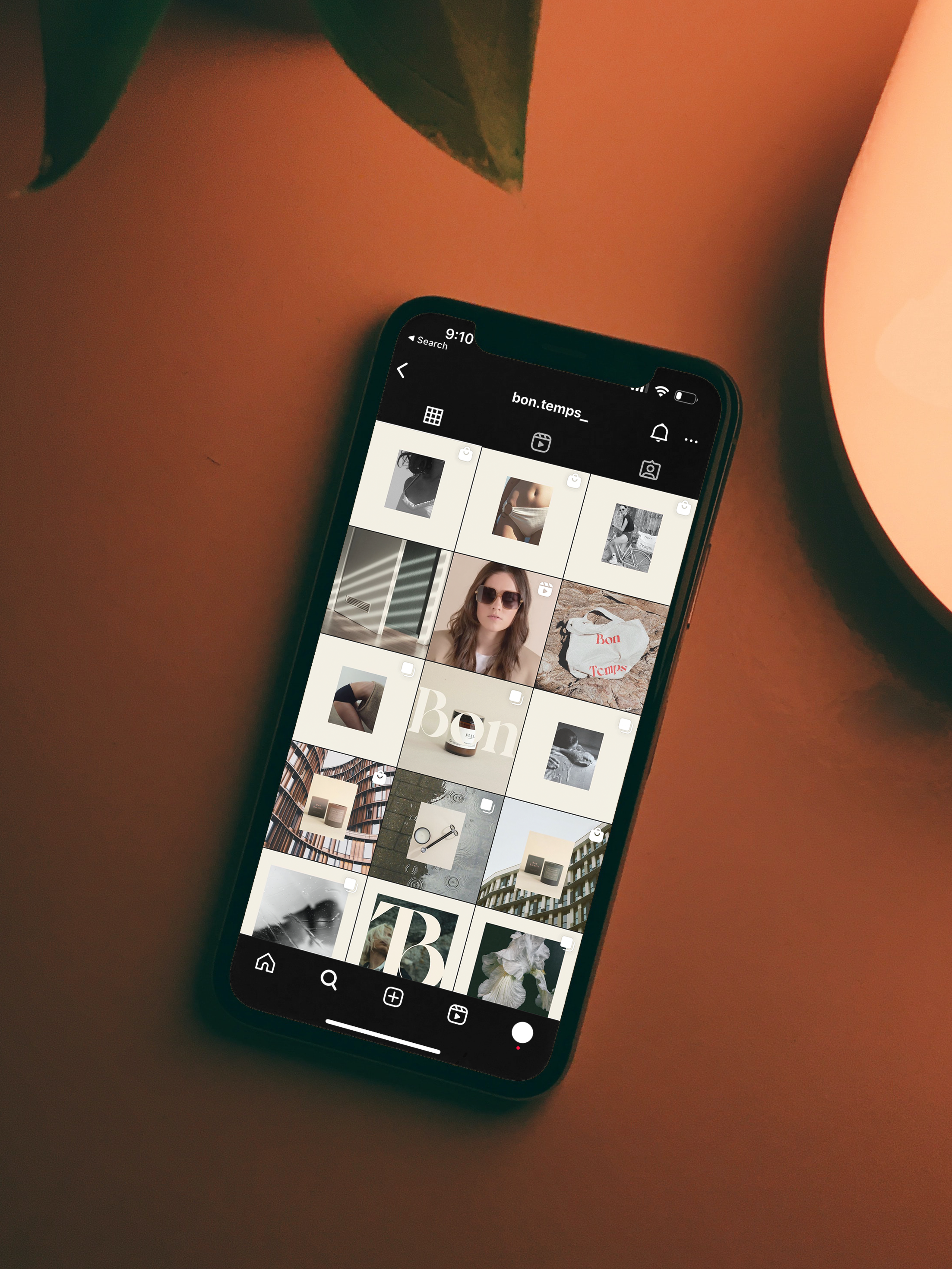
BON TEMPS is lifestyle brand and boutique that is rooted in human connection. They encourage others to find pleasure in discovery, design, and beauty by honoring the way we all choose, cherish and organize the objects that surround us. (And bonding over what makes us feel good).
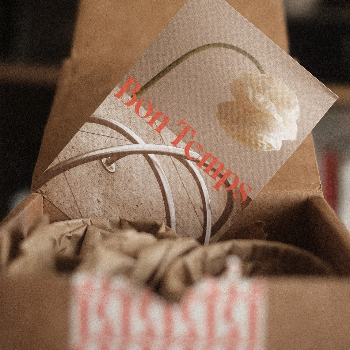
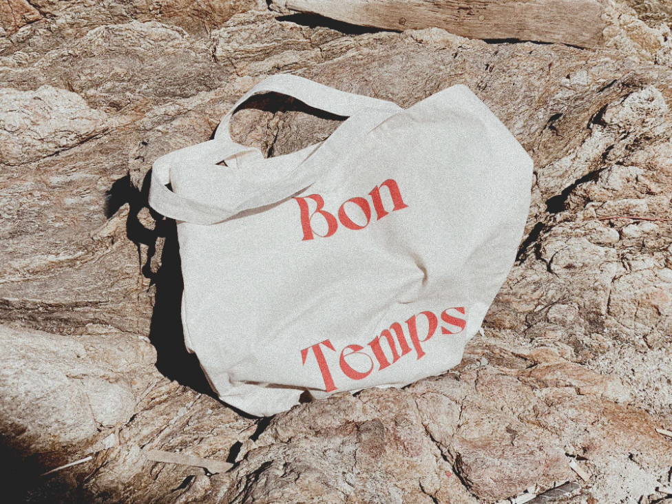
The visual identity was created with these principles in mind and incorporates photgraphic duality, romantic typefaces, vibrant red, and ample florals—which help to bring that passionate search for beauty to the forefront to a person that loves to dive into the details.
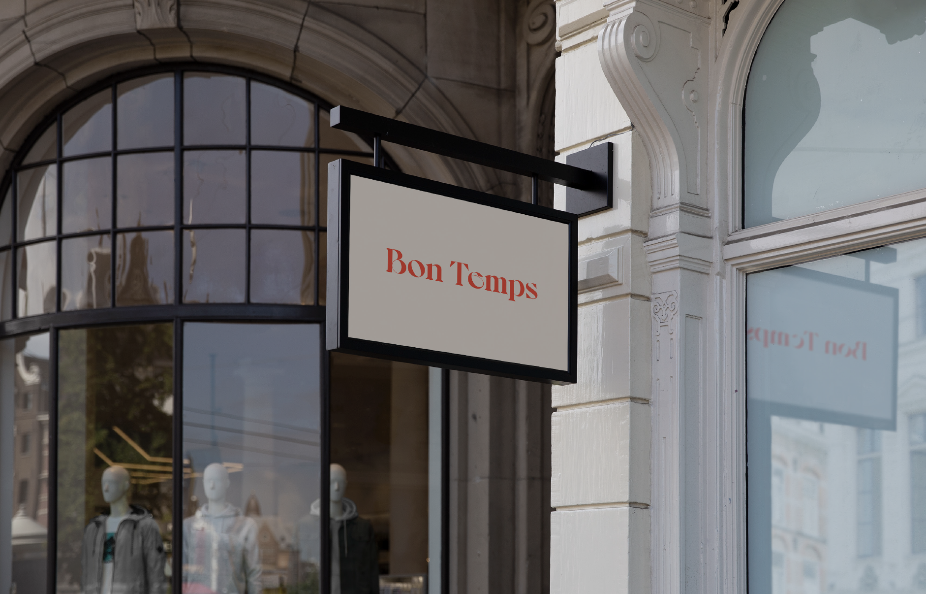
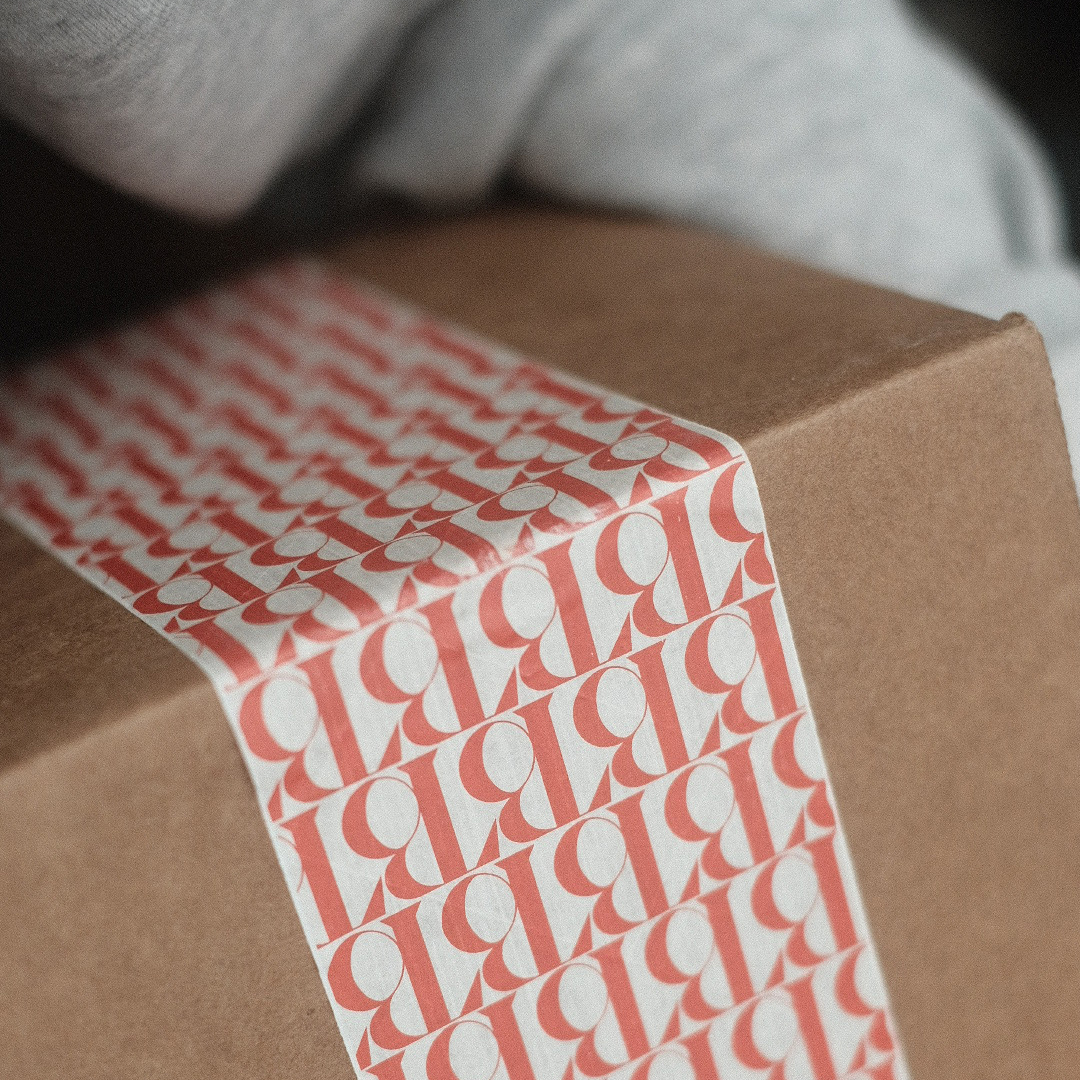
The primary brand colour is bright red—happy, passionate and filled with love. Used sparingly, and reserved for the logo and areas of emphasis.
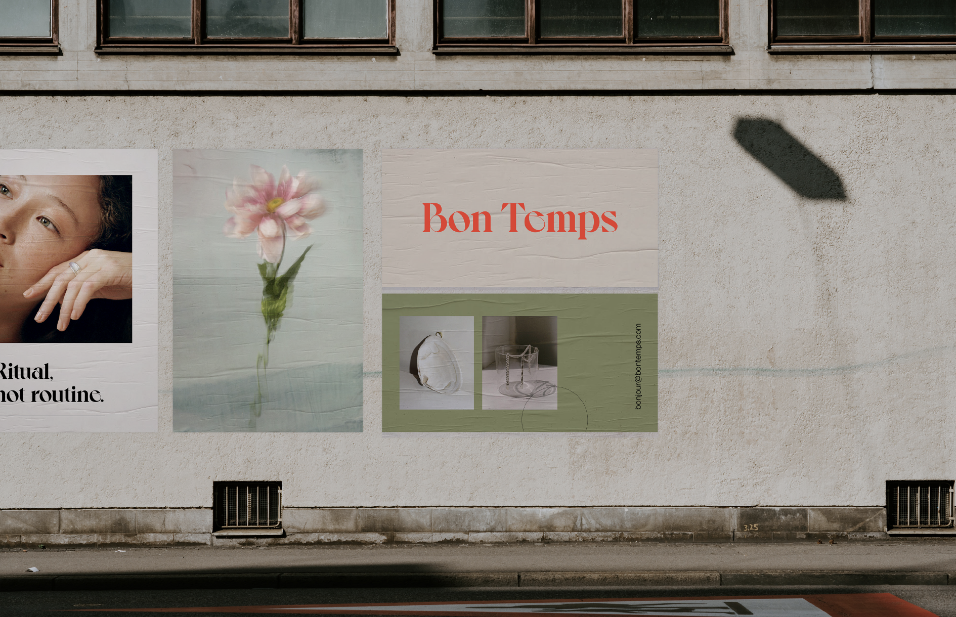
A key element of the visual identity involves pairing imagery to create a sense of duality. Products, portraits, and spaces are combined with imagery that is typically seen as "gross", "strange" or just generally "off"—driven by the idea that you can find beauty anywhere if you look close enough.
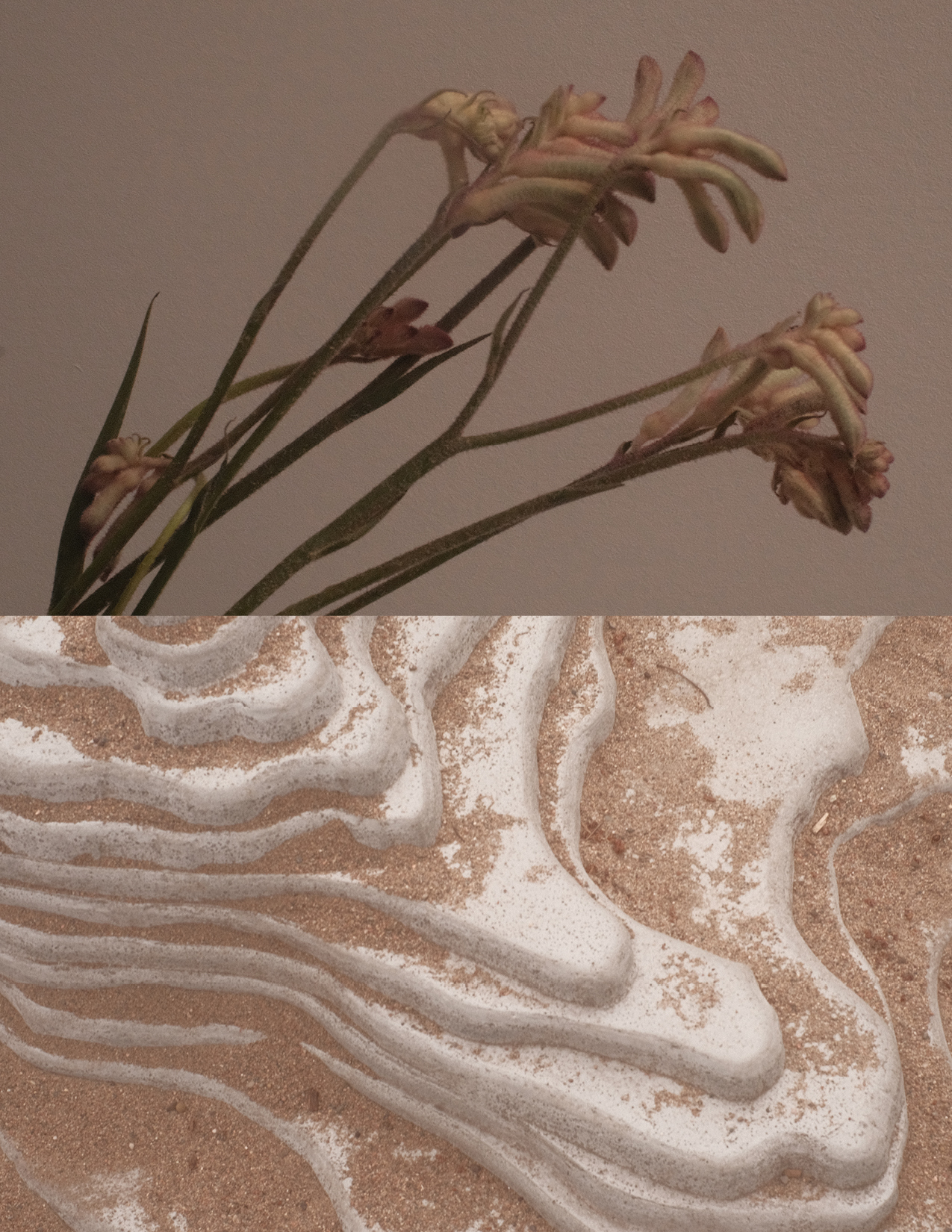
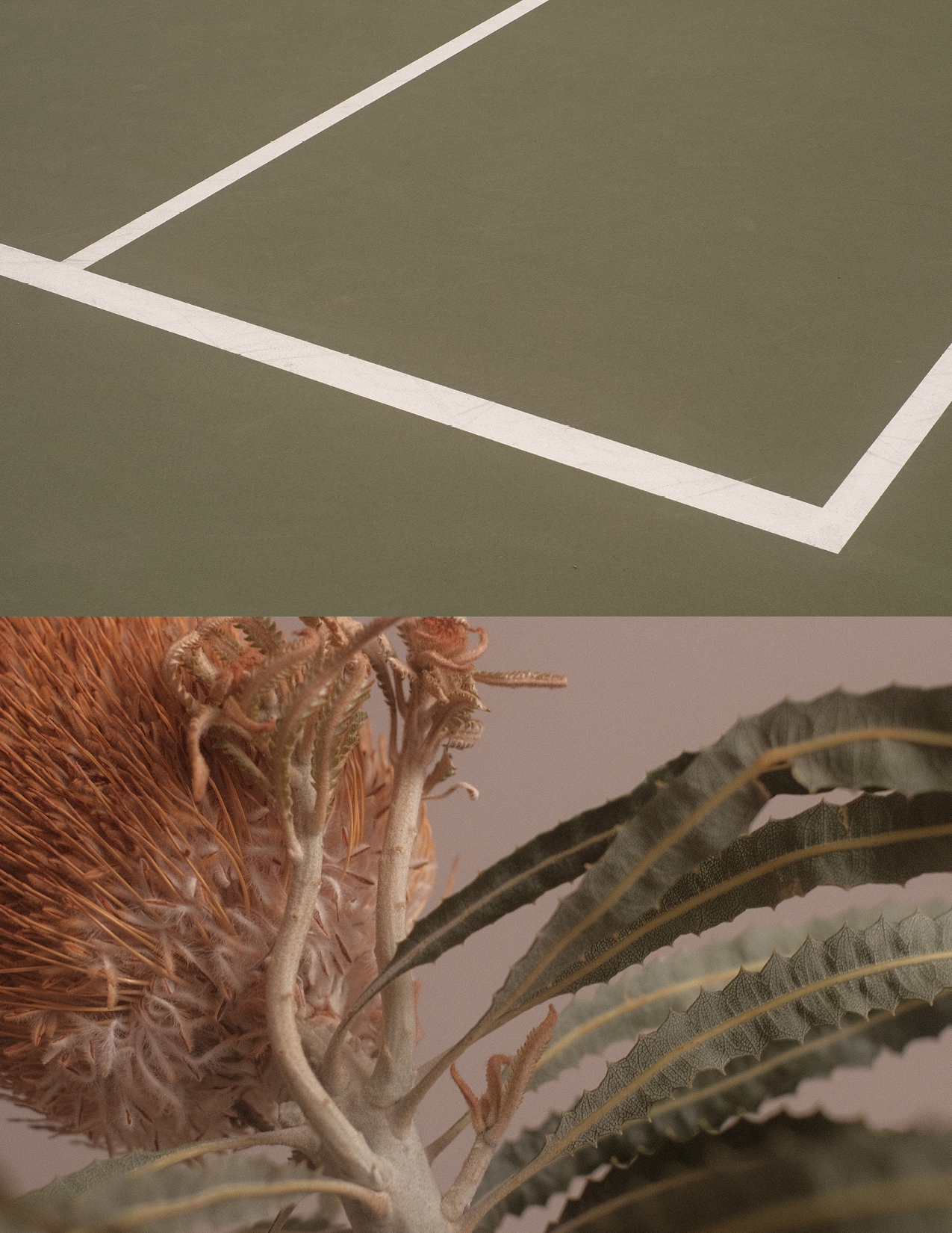
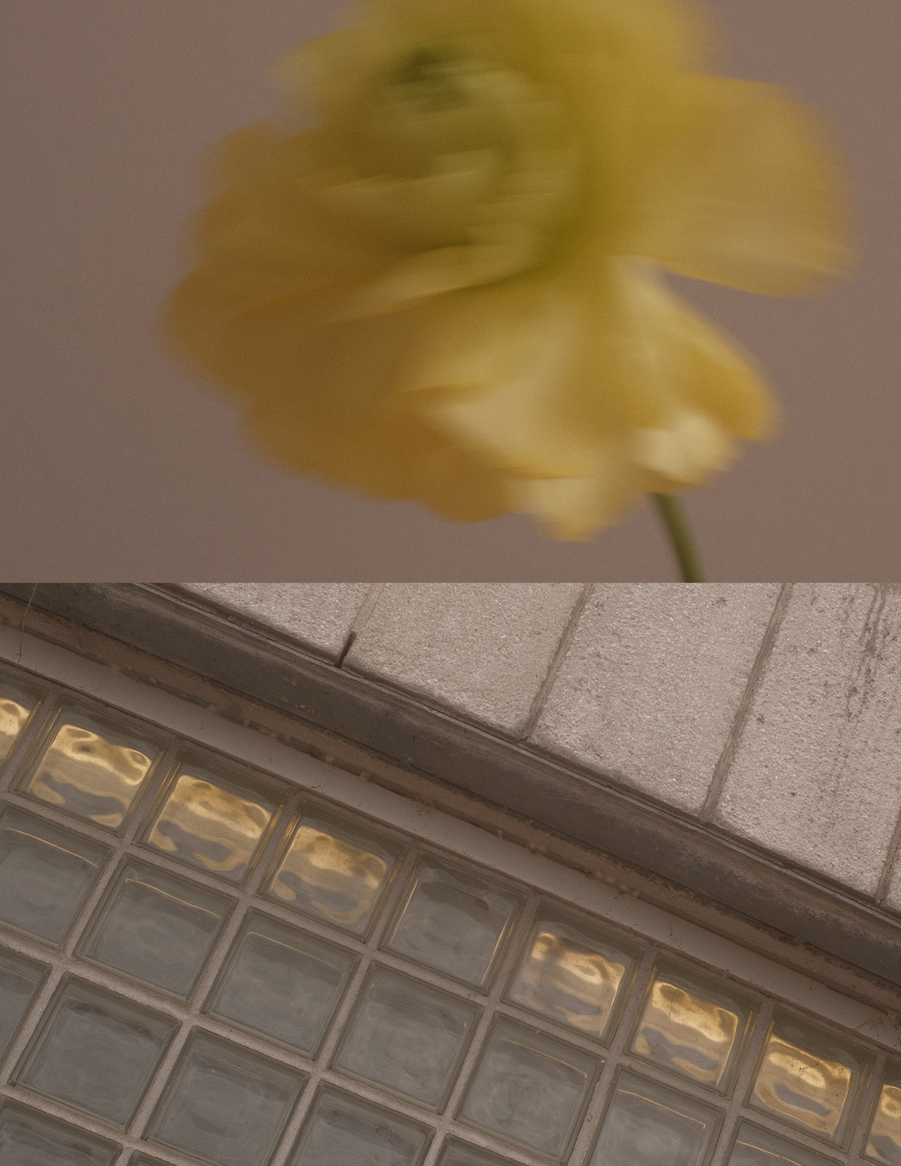
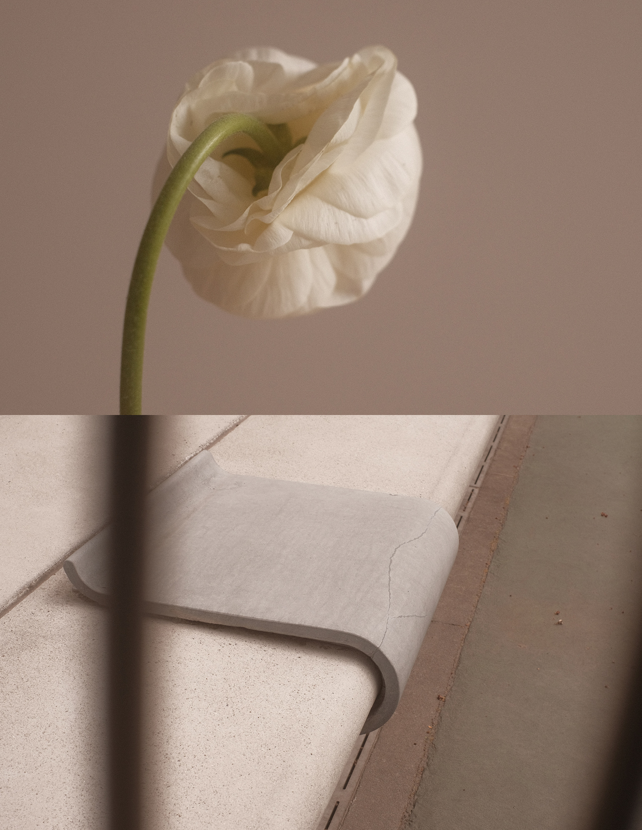
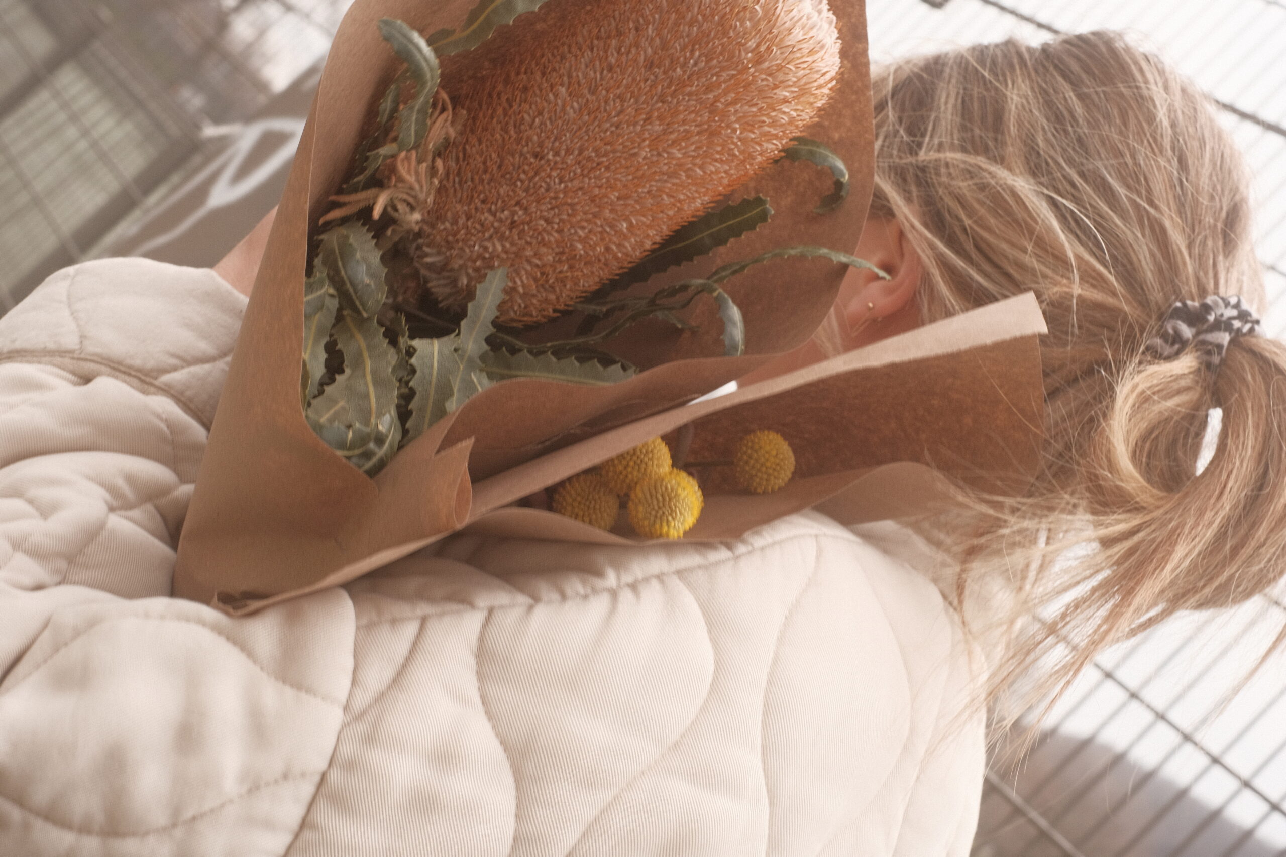
Il y a des fleurs partout pour qui veut bien les voir.
Going futher, inspired by the idea of seeing beauty when we want to, we also take the above statement literally by incorporating florals into our visual expressions.
THE TEAM
Creative Direction | Isabelle Roy
Art Direction + Design | Jennifer Dunaj
Selected Works
Whatever Feels GoodCampaign
Find your fitCampaign
I'm High Right NowCampaign
CANVASXM
NeighborgoodsBranding
Bon TempsBranding
Mx.3XM + Retail